

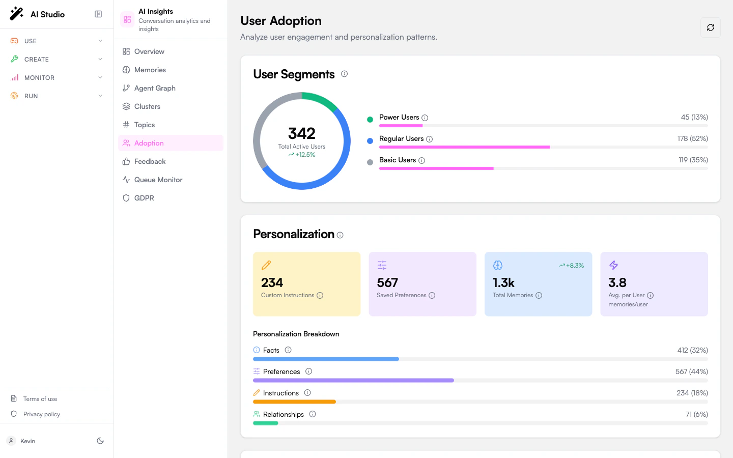
User segments
A donut chart segments your active users into three buckets:
The card shows total users, the count and percentage in each segment, and a trend badge against the previous period.
If the org has no user data yet, the card shows a “No user data” empty state.
Personalization
Four metrics that summarize how much the agents are learning about users:
A type breakdown is plotted below the metrics: Facts / Preferences / Instructions / Relationships, with progress bars and percentages. Hover any label for a tooltip describing what each type stores.
Quality
Four quality metrics rolled up across analyzed conversations:
If no conversations have been analyzed yet, this card shows “No data”.
Common patterns
A short table of recurring usage patterns the analytics pipeline detected — for example “users asking the same workflow question across multiple agents”. Each row shows the pattern, the number of associated instructions, and how many distinct users it covers.Recommendations
Priority-ranked actions to grow adoption. Each recommendation has:- A priority badge (high / medium / low).
- A short action string.
- An optional target segment (e.g. “Basic Users”).
- An optional metric value (e.g. “+18% personalization”) showing the projected impact.
Aggregation freshness
Adoption metrics are computed from a daily aggregation. After a large analysis run or fresh memory capture, the page may show stale numbers until the next cycle. A “Waiting for aggregation” banner is shown when the most recent aggregation hasn’t completed yet. You can force a recomputation from the Organization dashboard using the Recalculate metrics menu action.Where to go next
Memories
The memory store the personalization metrics are built on.
Feedback
Likes, dislikes, and their categorized reasons.
Topics
What users are talking to your agents about.
Agent network
The agent fleet whose adoption you’re measuring.