

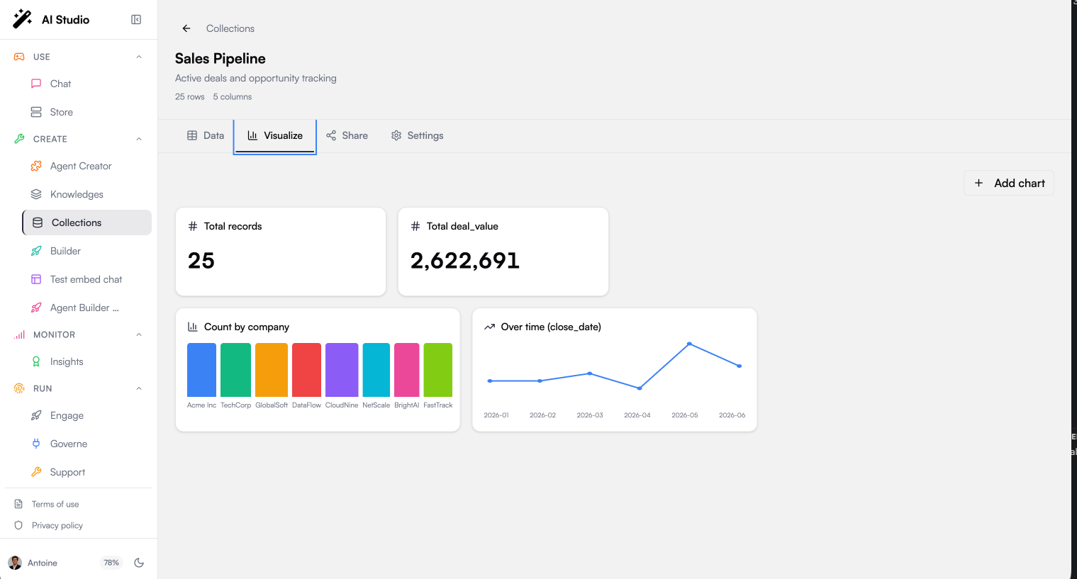
What the Visualize tab looks like
Open a collection and switch to Visualize. You’ll see:- a row of KPI cards (single headline numbers) at the top,
- below them, a grid of charts (bar, pie, line),
- and an Add chart button that opens the chart builder.
The four building blocks
Every chart is defined by four choices. Understanding them is enough to build any view:
A chart is therefore read as <aggregation> of <measure>, grouped by <dimension>, shown as <chart type>, e.g. sum of
amount by stage, as a bar chart.
Build a chart, step by step
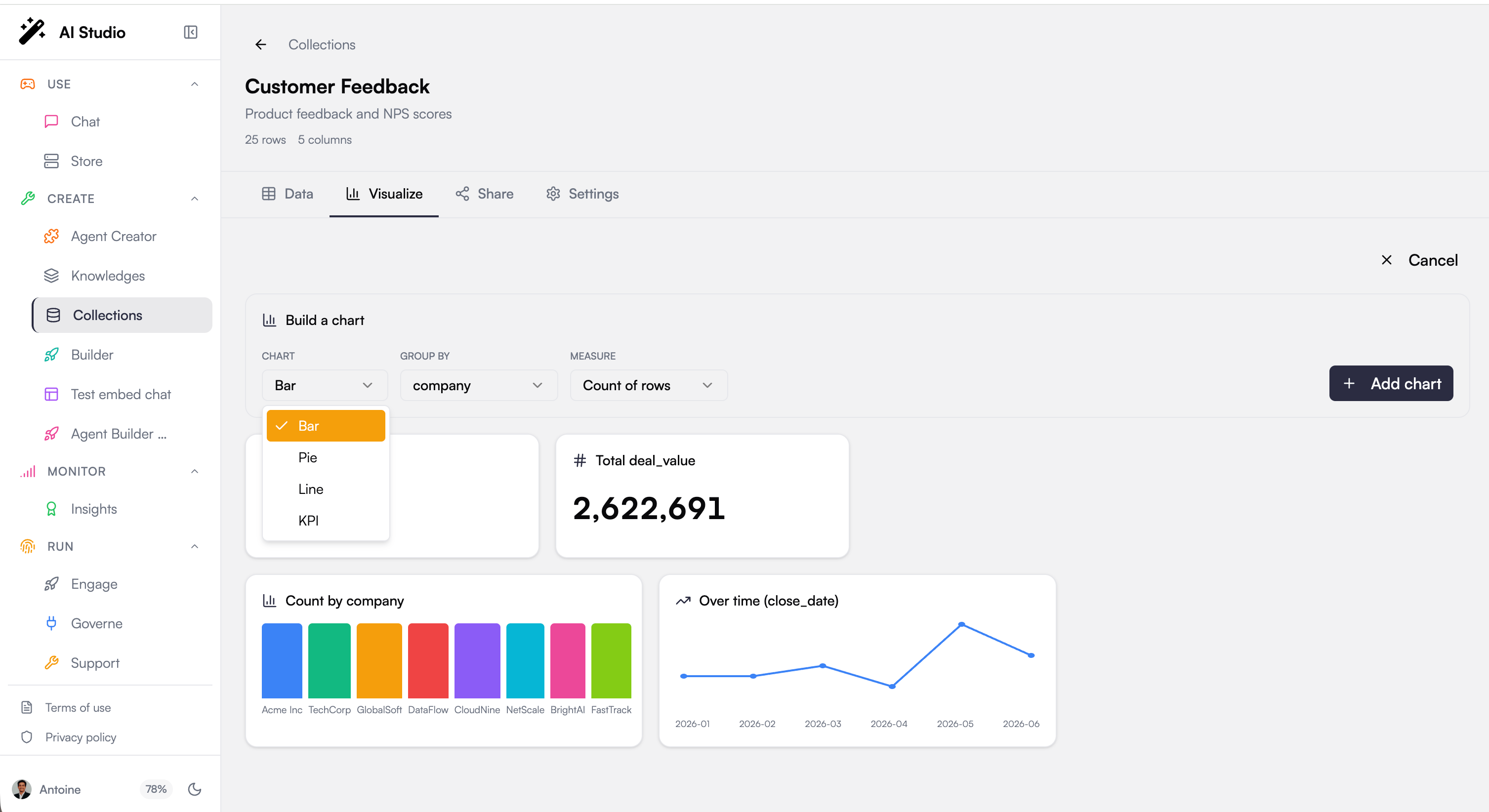
stage (text), amount (number) and is_won (boolean) columns.
1
Open the builder
On the Visualize tab, click Add chart. The builder appears above the KPIs.
2
Pick the chart type
Choose Bar, we’re comparing a value across categories.
3
Choose the dimension
In Group by, select
stage. Each bar will be one stage.4
Choose the measure and aggregation
In Measure, select
amount (instead of Count of rows). In Aggregation, select Sum. Each bar’s height is now the total amount for that stage.5
Add it
Click Add chart. The chart is created, sorted from highest to lowest, and saved with the collection, it will still be there after a refresh, for everyone who can see the collection.
Recipes
Concrete settings for common questions. Read each row as the four choices in the builder:How the numbers are computed
The theory behind the builder, so results never surprise you:- Exact, server-side aggregation. Charts don’t sample the visible page, they aggregate the whole collection in the database (SQL
GROUP BY/ equivalent), the same engine agents use. A “sum of amount by stage” chart and an agent answering “total by stage” always match. - One dimension at a time. A chart groups by a single column. For a two-dimension cross-tab, build two charts or filter the data.
- Sum/Average/Min/Max need numbers. These aggregations only apply to numeric columns; on text/date columns, use Count of rows. Empty cells are skipped by sums and averages.
- Dates are bucketed by month. A Line over a date/datetime column groups points by month and orders them chronologically, so a daily timestamp column still gives a clean monthly trend.
- Top values first. Bar and pie charts sort by value (largest first) and show the top slices, so the most important categories are always visible.
- Empty groups are labelled. Rows with no value for the grouping column are gathered under an “(empty)” label rather than dropped.
Best Practices
Aggregate on clean categories
Aggregate on clean categories
Charts group by exact values. Normalize category columns (consistent casing and wording) before importing, or you will see duplicate bars for the same logical category.
Watch out for missing values
Watch out for missing values
Sums and averages skip empty cells. If a numeric column has many gaps, count-based views give a more honest picture of your data.
Keep collections focused
Keep collections focused
Since charts are derived from your schema, a collection mixing unrelated record types produces confusing visualizations. One topic per collection keeps dashboards readable.
Next Steps
Working with Data
Clean your data to improve your charts
Using Collections with Agents
Let agents run the same aggregations conversationally