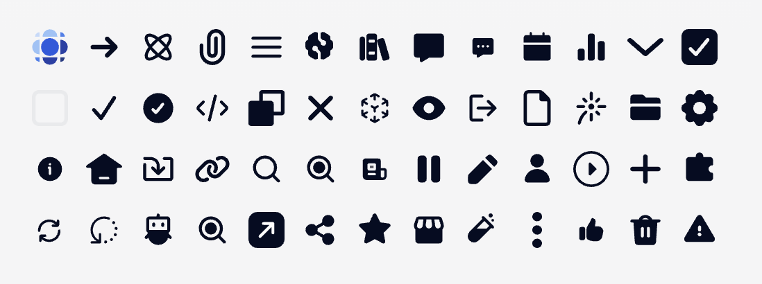
Minimal usage
icon is the name of any available icon:
- prisme.ai
- arrow
- arrow-to-center
- arrow-to-outer
- arrow-wall
- attachment
- atom
- back
- bars-three
- brain
- books
- bubble
- bubble-annotation
- calendar
- charts
- chevron
- code-bracket
- images
- list-star
- pencil-magic
- checkbox-checked
- checkbox-unchecked
- checkmark
- circle-checkmark
- code
- copy
- cross
- cube
- download
- expand
- eye
- export
- file
- file-bend
- filter
- firework
- funnel
- folder
- gear
- help
- home
- import
- link
- magnifier
- magnifying-filled
- navigate
- news
- pause
- pencil
- people
- play
- plus
- privacy
- puzzle
- reload
- regen
- robot
- search
- send
- share
- sliders
- star
- store
- test-tube
- three-dots
- thumb
- tool
- tools
- trash
- warning
icon can also be an url to an image file but it’s usefull only for svg files. Use Image Block for any other uses.
Demo
Advanced usage
rotate can rotate the icon with a number value in degrees.
width and height can force dimensions. Without this, the icon will fit its container. Value can be any valid height/width in css.