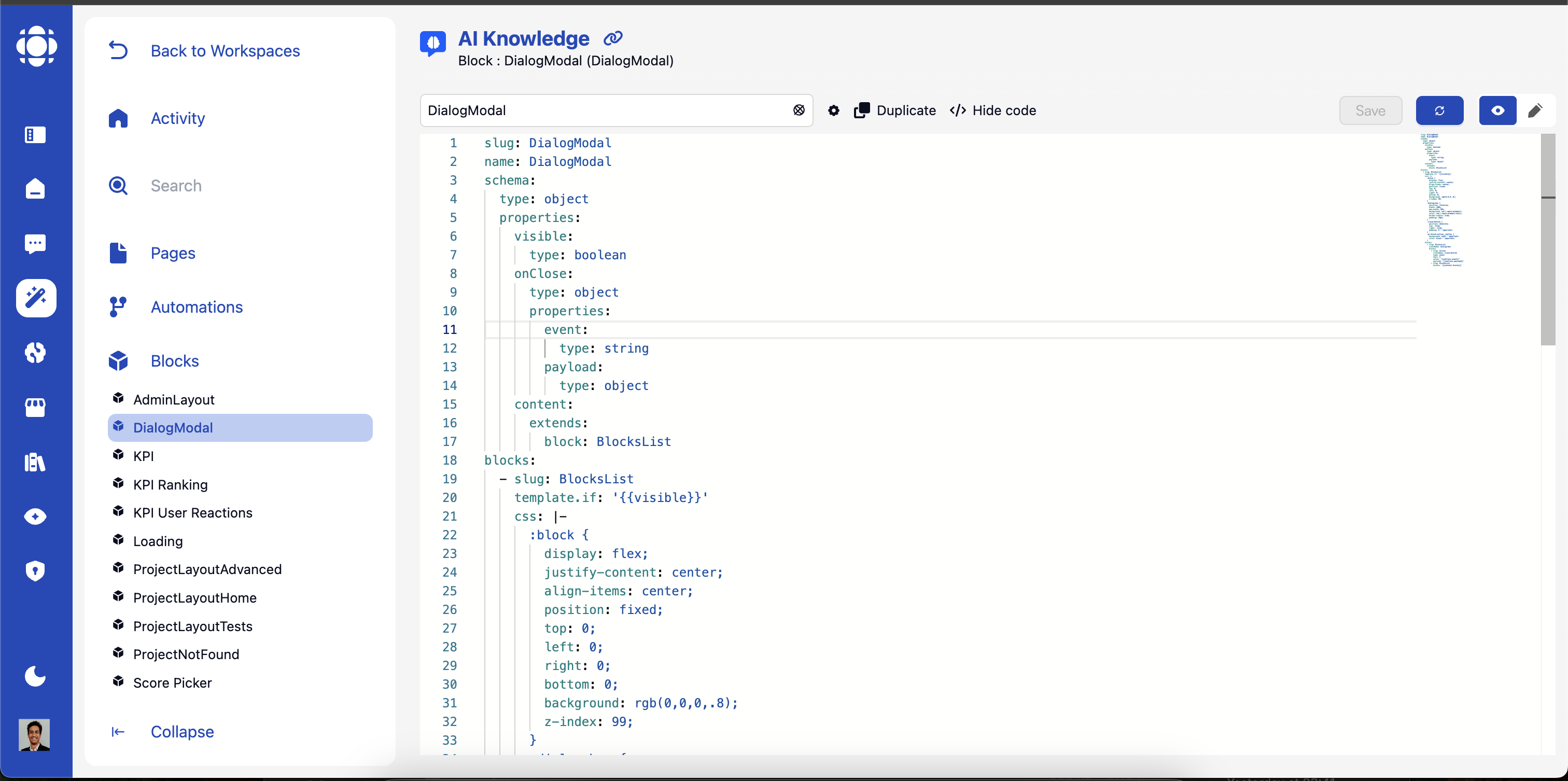
AI Builder Blocks Interface
Blocks are reusable UI components that serve as the building blocks for creating interactive interfaces in AI Builder. They encapsulate functionality, emit and listen for events, and can be assembled to create complete user experiences.

Block Fundamentals

  • What are Blocks?
  • Block Types
  • Block Communication
Blocks are modular UI components with specific purposes:
  • Self-contained: Each block encapsulates specific functionality
  • Reusable: Can be used across multiple pages and workspaces
  • Configurable: Customizable through properties and settings
  • Interactive: Respond to user actions and system events
  • Event-driven: Communicate with other components through events
Blocks follow the BlockProtocol.org standard, ensuring consistency and interoperability.

Common Block Properties

All blocks share a set of common properties that can be configured in YAML:
slug
string
Required. Unique identifier for the block in your workspace.
onInit
string
Event fired when the block is initialized. Example: myInitBlockEvent
updateOn
string
Event that triggers an update of the block. Example: myUpdateBlockEvent
automation
string
Name of the automation to associate with this block.
sectionId
string
Identifier for the section containing this block. Example: myBlock
className
string
CSS class name to apply to the block. Example: block-classname
css
string
Custom CSS for styling the block. Uses :block selector for the block root element.
:block {
  display: flex;
  max-width: 100%;
  flex: 1;
  flex-direction: column;
}
template.if
string
Conditional display expression. Block will only be shown if the expression evaluates to true.
template.repeat
string
Allows repeating the block for each item in an array. Example: repeat on myArray
item
string
Variable name for the current item when using repeat. Example: myItem

Built-in Blocks Library

AI Builder includes a comprehensive library of built-in blocks. Here’s a detailed reference for each block with its specific YAML configuration.

Marketplace Blocks

The following blocks are available after installing specific apps from the marketplace.

Block Event System

The event system is the core communication mechanism between blocks:

Event Types

Custom Initialization Events
Examples: datatable-block-init, form-block-init
Custom Update Events
Examples: datatable-block-update, chat-block-update
Block-Specific Events
Examples: form-change, block Action (emits an event with payload)

Event Communication Pattern

1

Event Definition

Blocks define the events they will emit:
- slug: Action
  text: Subscribe
  type: event
  value: user-subscribe
  payload:
    user: id
    product: productId
This creates an event on the system when the end user interacts with blocks
2

Event Subscription

Other automations register to receive specific events:
when:
  events:
    - user-subscribe
  endpoint: false

This tells the automation to listen for the specified event and call the appropriate handler when it occurs.

Advanced Block Features

Blocks can be composed from other blocks to create higher-level components:
  • Container Blocks: Wrap and organize other blocks
  • Composite Blocks: Combine multiple blocks into a cohesive component
  • Layout Blocks: Control the arrangement of nested blocks
  • Wrapper Blocks: Add functionality to existing blocks
Composition enables reuse and maintains separation of concerns.
Blocks can be styled through multiple approaches:
  • CSS Editor: Direct CSS customization
  • Built-in CSS: Keeping the default CSS
  • CSS Classes: Predefined style sets
Consistent styling ensures a cohesive user experience.
Blocks can have conditional behavior based on various logical factors:
  • Block Display Condition (if): Example: if MyCondition
  • Repeat Block on Array: Example: repeat on MyTable
  • Variable Name for Each Item: Example: MyVariable
Conditions enable dynamic, responsive interfaces.

Block Best Practices

Single Responsibility

Design blocks to do one thing well:
    Focus on a specific UI functionAvoid creating overly complex blocksSplit complex functionality into multiple blocksCreate specialized blocks for specific use cases

Clear Naming

Use consistent, descriptive naming:
    Choose clear, descriptive block namesUse consistent terminology across blocksEstablish naming conventions for properties and eventsDocument the purpose of each block

Robust Error Handling

Design blocks to handle failures gracefully:
    Validate inputs and handle edge casesProvide clear error states and messagesImplement fallback behavior for missing dataLog issues for troubleshooting

Accessibility

Ensure blocks work for all users:
    Follow WCAG guidelines for accessibilitySupport keyboard navigationInclude screen reader compatible markupMaintain sufficient color contrast

Responsive Design

Optimize blocks for all device sizes:
    Test across different screen sizesImplement responsive layoutsAdjust content for mobile displaysUse relative units for sizing

Performance Optimization

Keep blocks efficient and responsive:
    Minimize unnecessary rendersOptimize heavy operationsImplement loading states for async operationsUse lazy loading where appropriate

Next Steps